A Design System for Mayo Clinic Labs
I recently took a course on Design Systems University by Dan Mall, an expert in and pioneer of design systems. For the uninitiated, a design system is
“A connected, package-managed, version-controlled software product that contains the smallest set of components and guidelines a particular organization needs to make digital products consistently, efficiently, and happily.”
At the time of this writing, I am a UX Designer at Mayo Clinic Labs, so I thought using the mayocliniclabs.com website would be an instructive exercise upon which to practice building a design system. In the following case study, I will guide you through the process I took to build a design system in design and in code.
A Design System in Figma
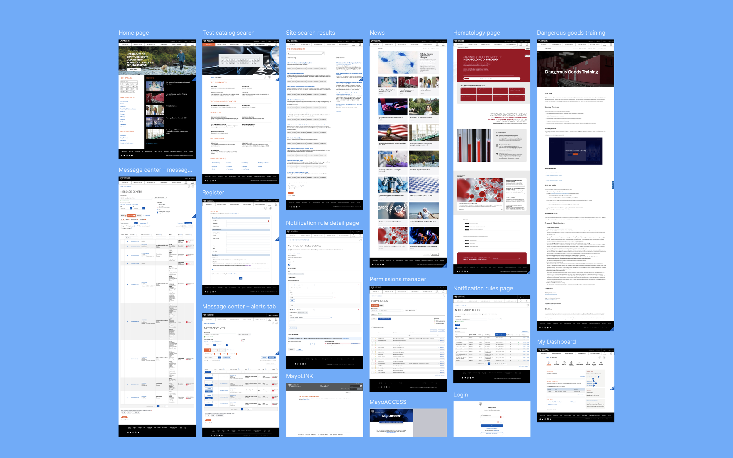
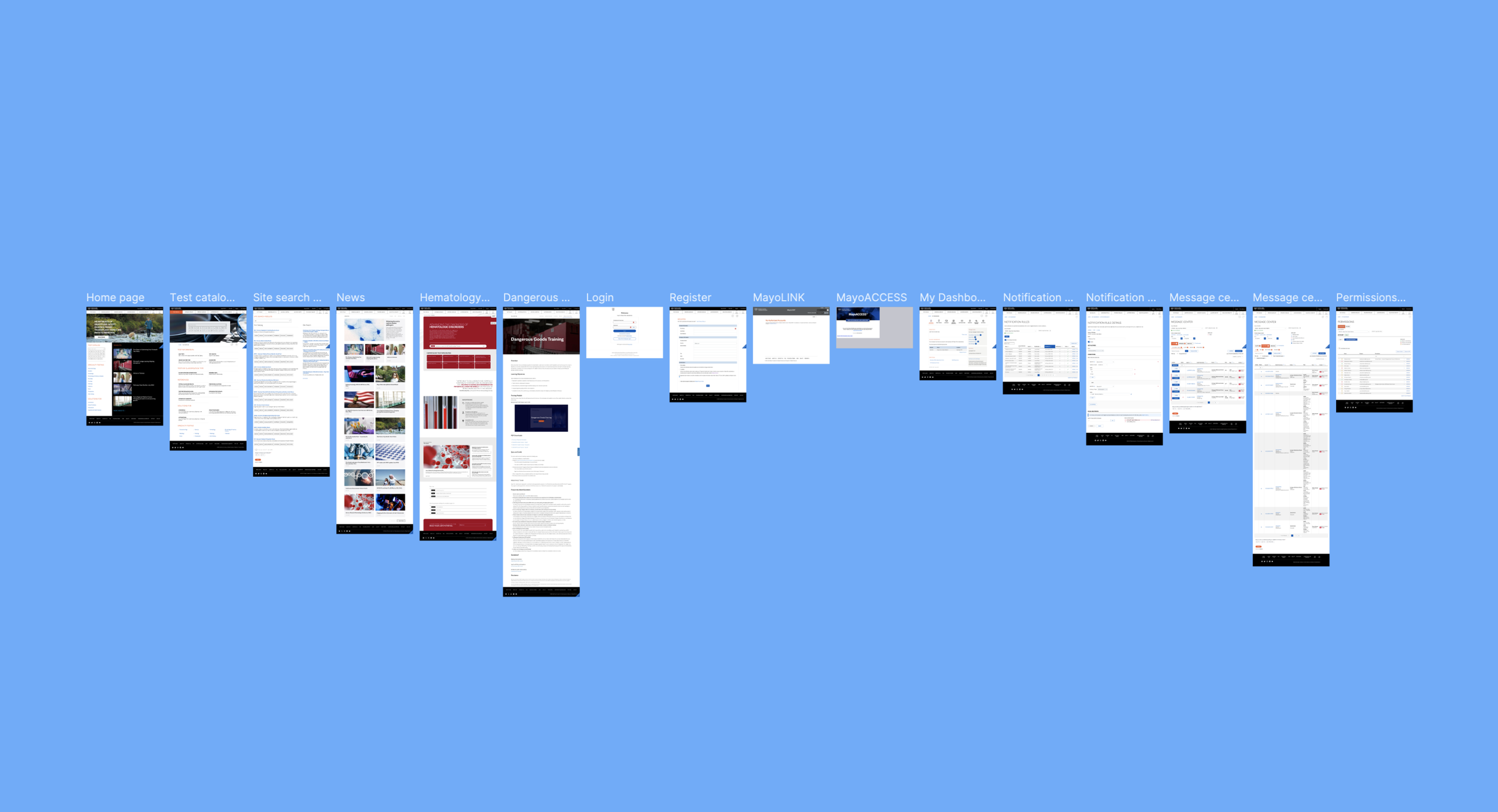
Let’s build a design system for MCL in Figma! We’ll start by documenting 16 pages from MCL that represent the highest trafficked and most critical pages on the website.
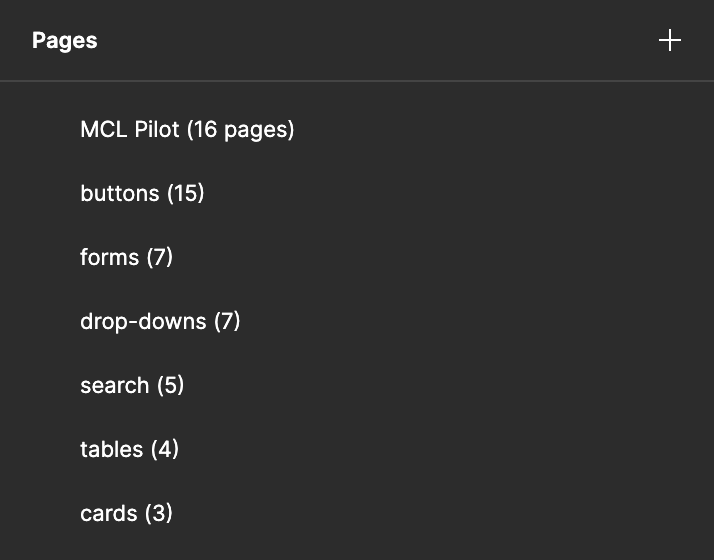
Now let’s visually scan these pages for components and make a list of the different common components that appear throughout the pages. Let’s also make a note of the number of pages in which each component appears.
When it comes time to building components, this process will help us determine which components will save future designers and developers the most time.
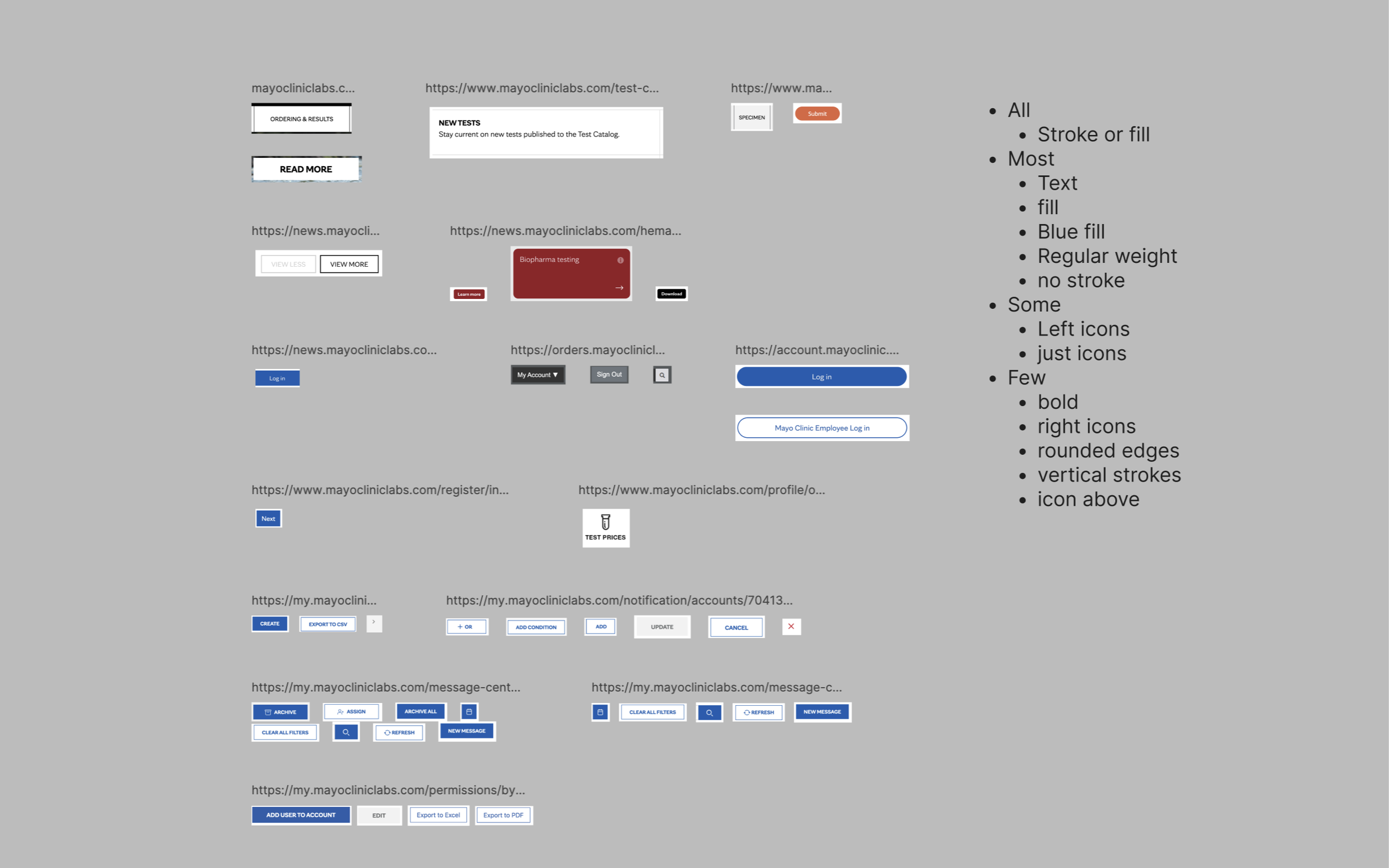
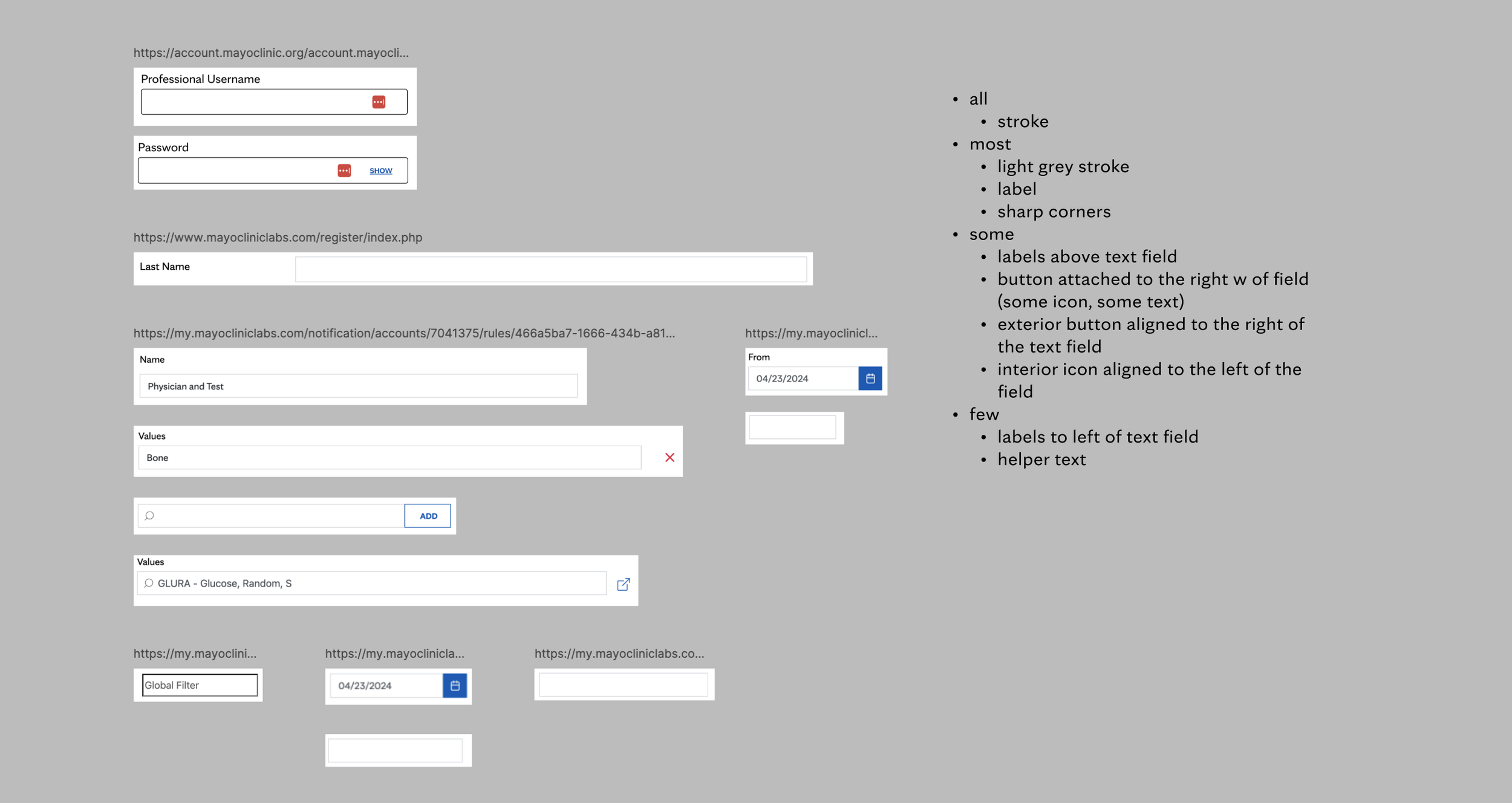
Now, let’s gather different instances of each component to gauge the degree of variation that exists. We’ll also make a note of which stylings and elements are common to all, most, some, and few of the component instances.
Audit of mcl buttons. Note how much variation there is between buttons. Much of this reflects redundant work that could be streamlined.
Audit of MCL forms. In addition to adding hundreds of extra hours of manual labor to designer and developer workflows, this level of variety in components damages the trust that the user has in the MCL brand. The standardization inherent in components protects the brand from user distrust.
Before we take off creating components, let’s create tokens — essential for any modern design system - using Figma’s Variables feature.
These tokens, which have semantic names for color, reference “source of truth” colors called Primitives. Soon, you’ll see how much power and flexibility this gives the design system.
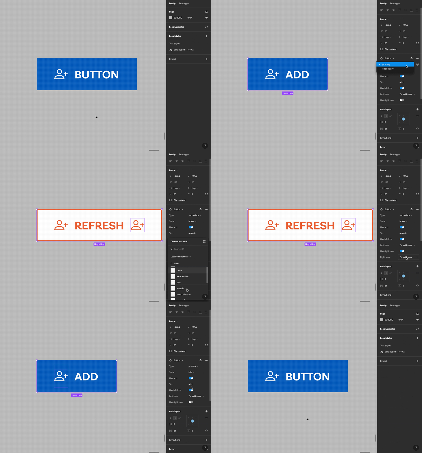
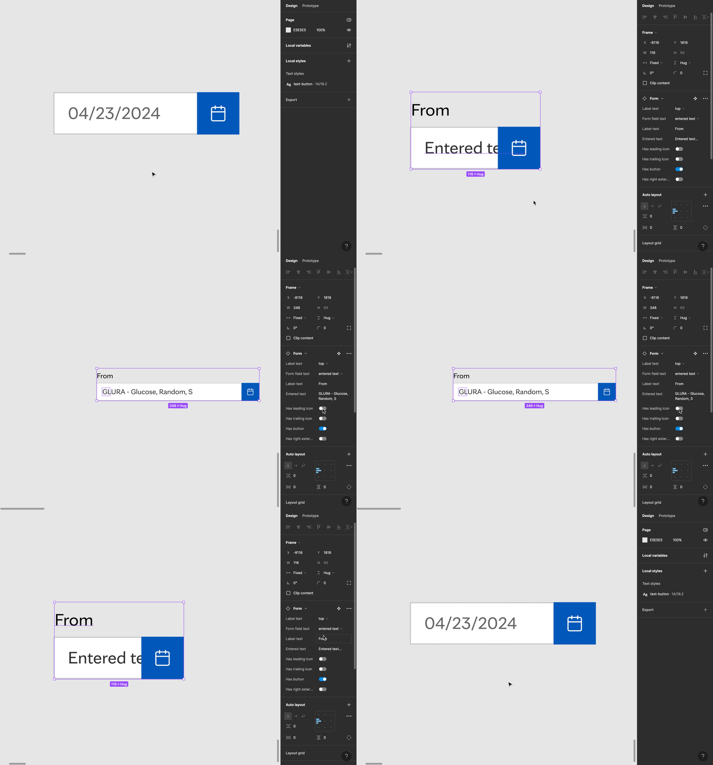
Applying these color tokens as we go, let’s build some components. I chose three components to build out: buttons, forms, and tables.
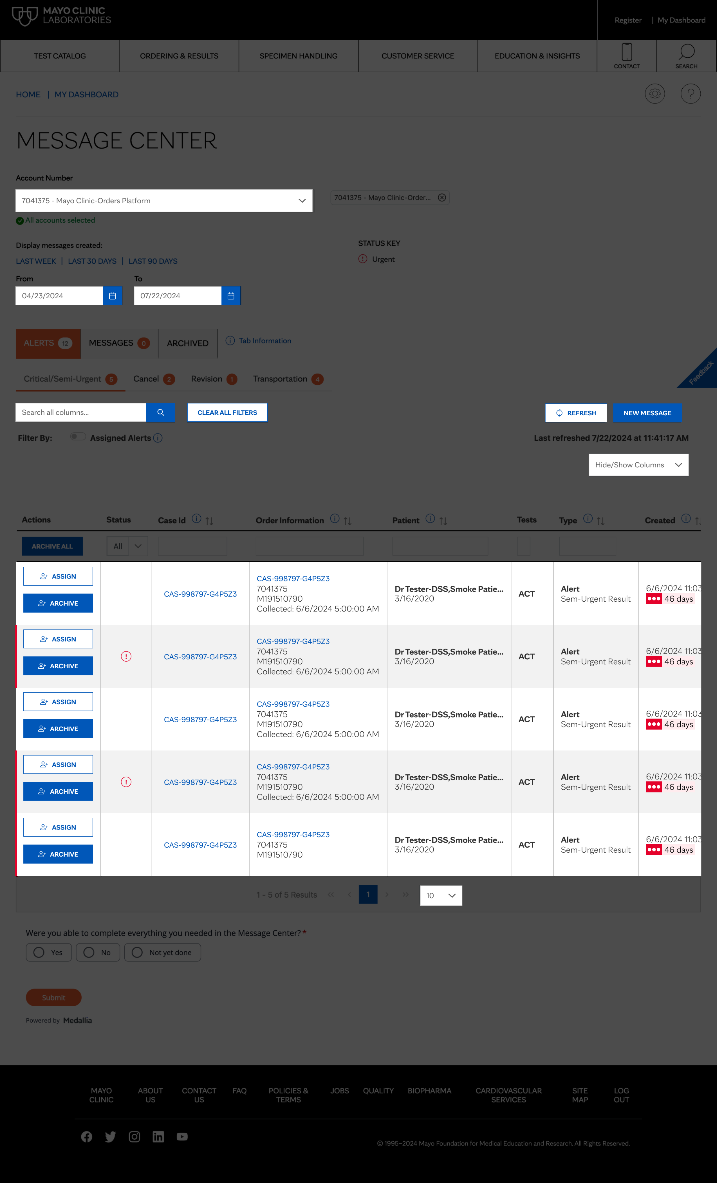
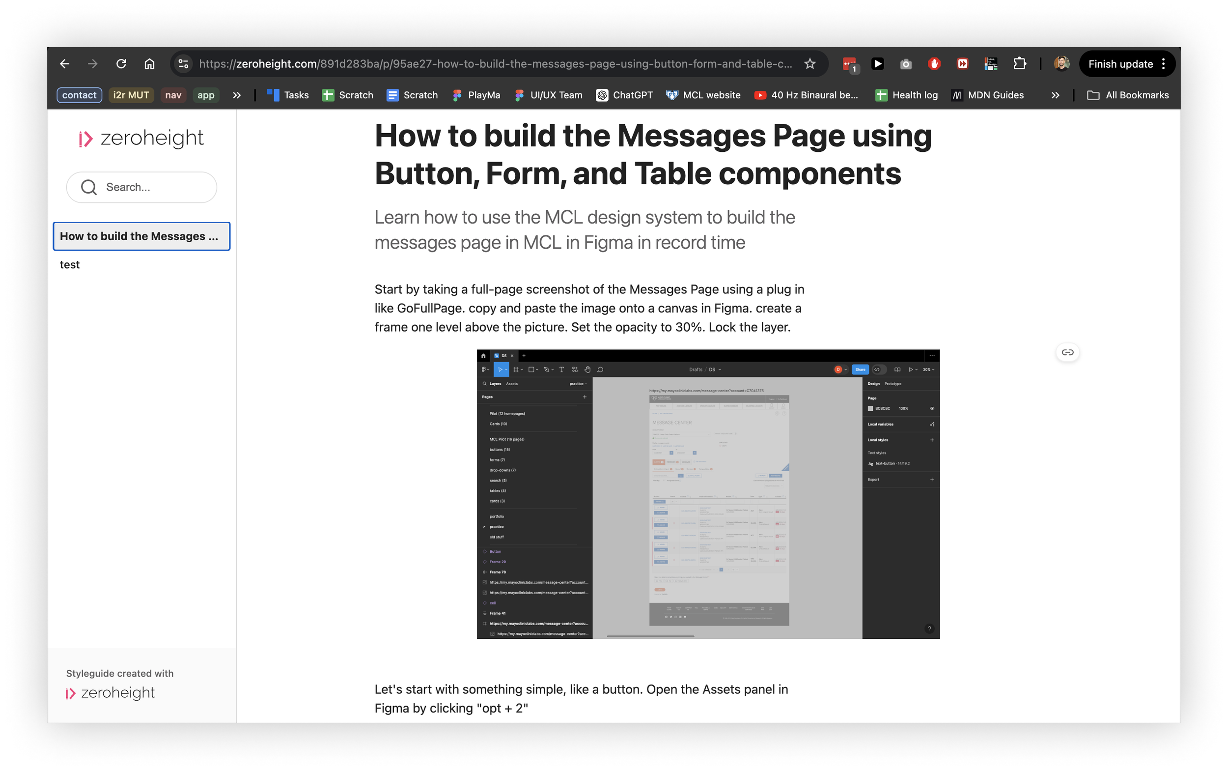
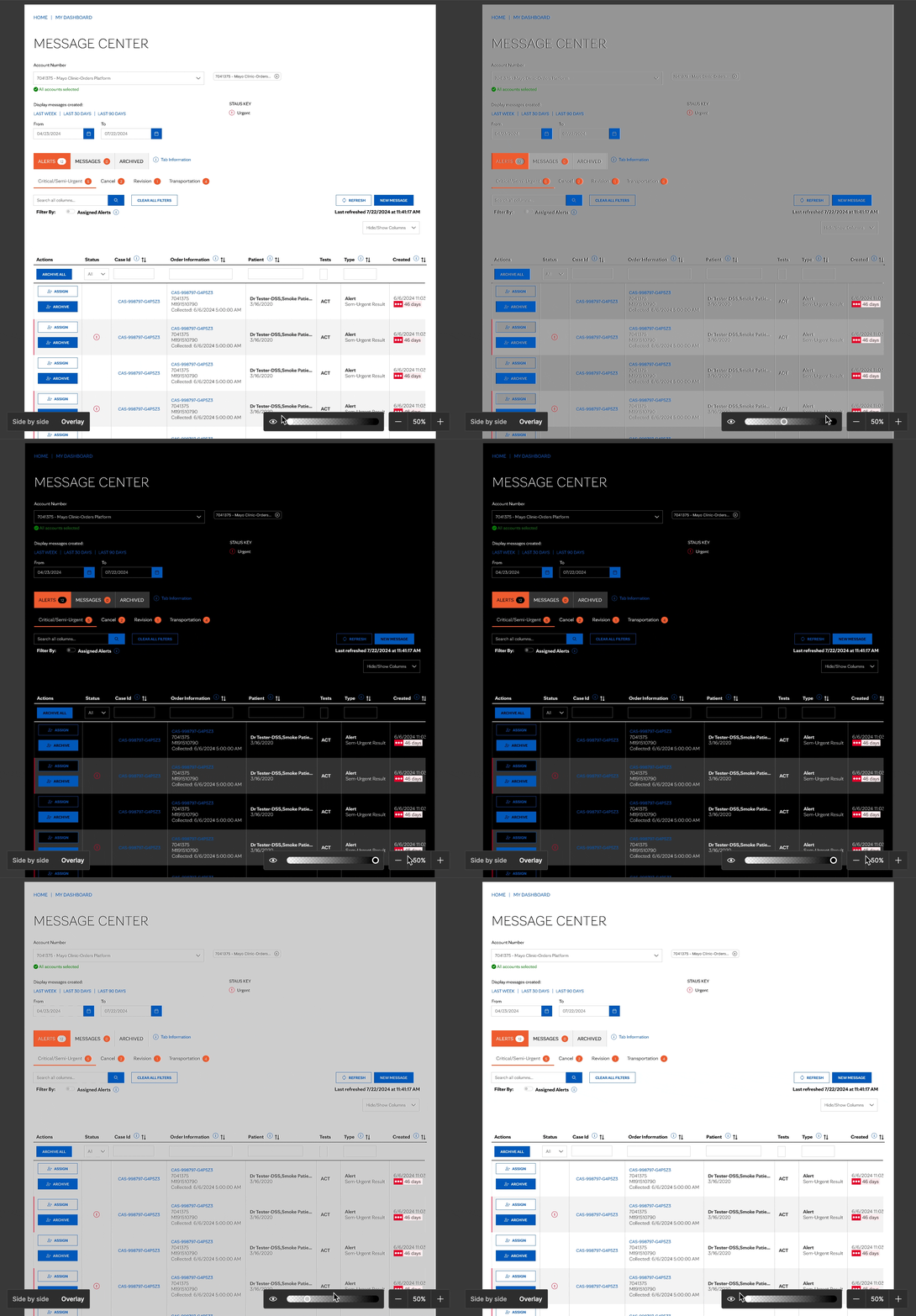
Now, let’s see the payoff! Let’s select a page-- the Message Center page in MCL-- to recreate using components as a proof of concept for this design system.
Before: A dim screenshot of the messages page.
After: Half the page built out purely with components.
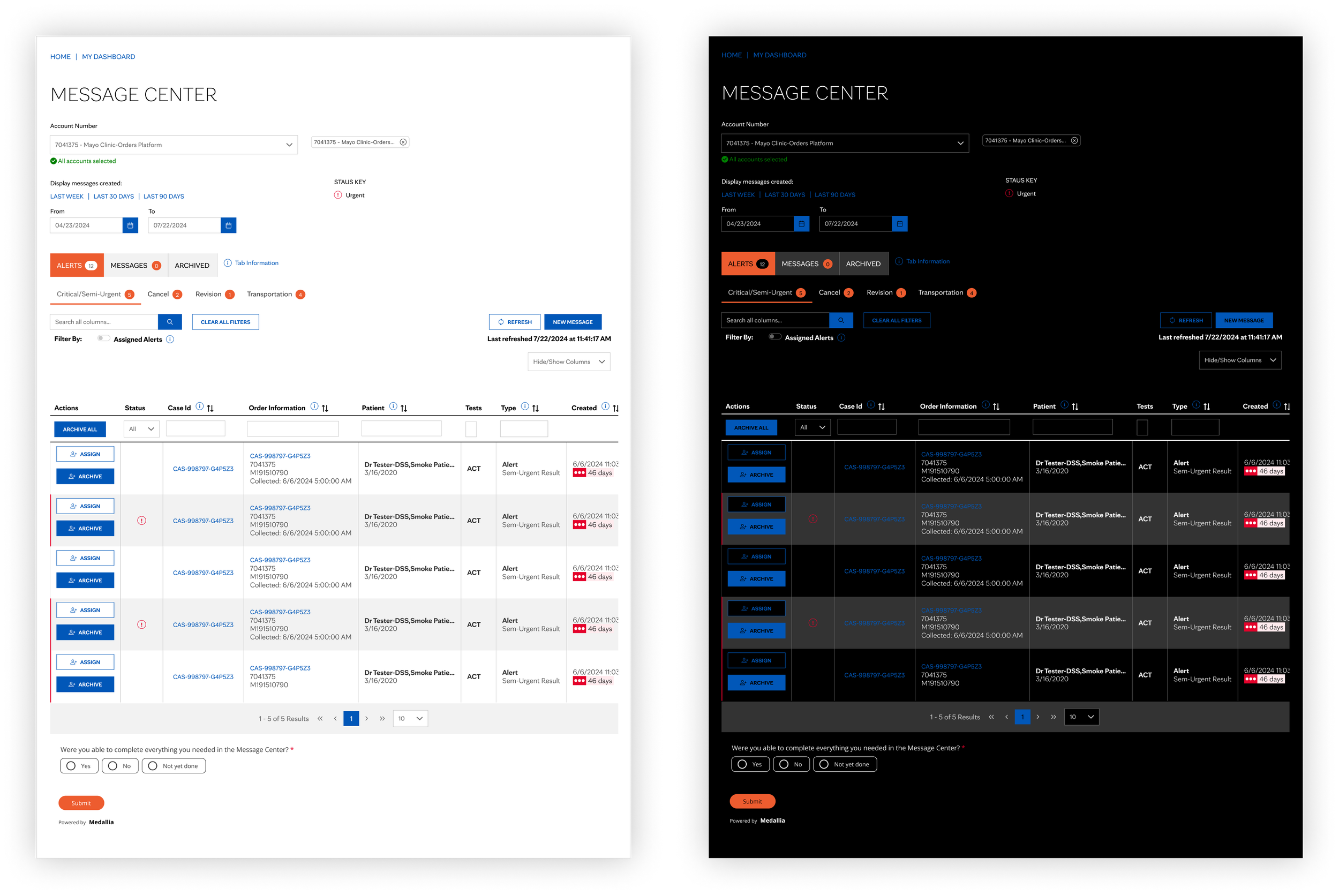
Using just button, form, and table components, we recreated half the messages page in record time! This turned a task that ordinarily would have taken hours into minutes. And it made the consistency of design elements in the page less prone to human error. Not to mention the vastly greater number of hours that we can save designers and developers in the future, since we can reuse these components to build future products!
Let’s build the rest of the page out using customs designs, just for good measure!
While we’re building out the page, let’s start creating a reference website to document our design system. This will help convey its advantages to other team members so that they want to adopt it!
What ever happened to those pesky tokens? Well, since we applied them to our reusable components while we were designing upfront, something really cool is just a few clicks away...
“oooooh” “aaaaaaaah” 🤤
Introducing MCL Dark Mode!
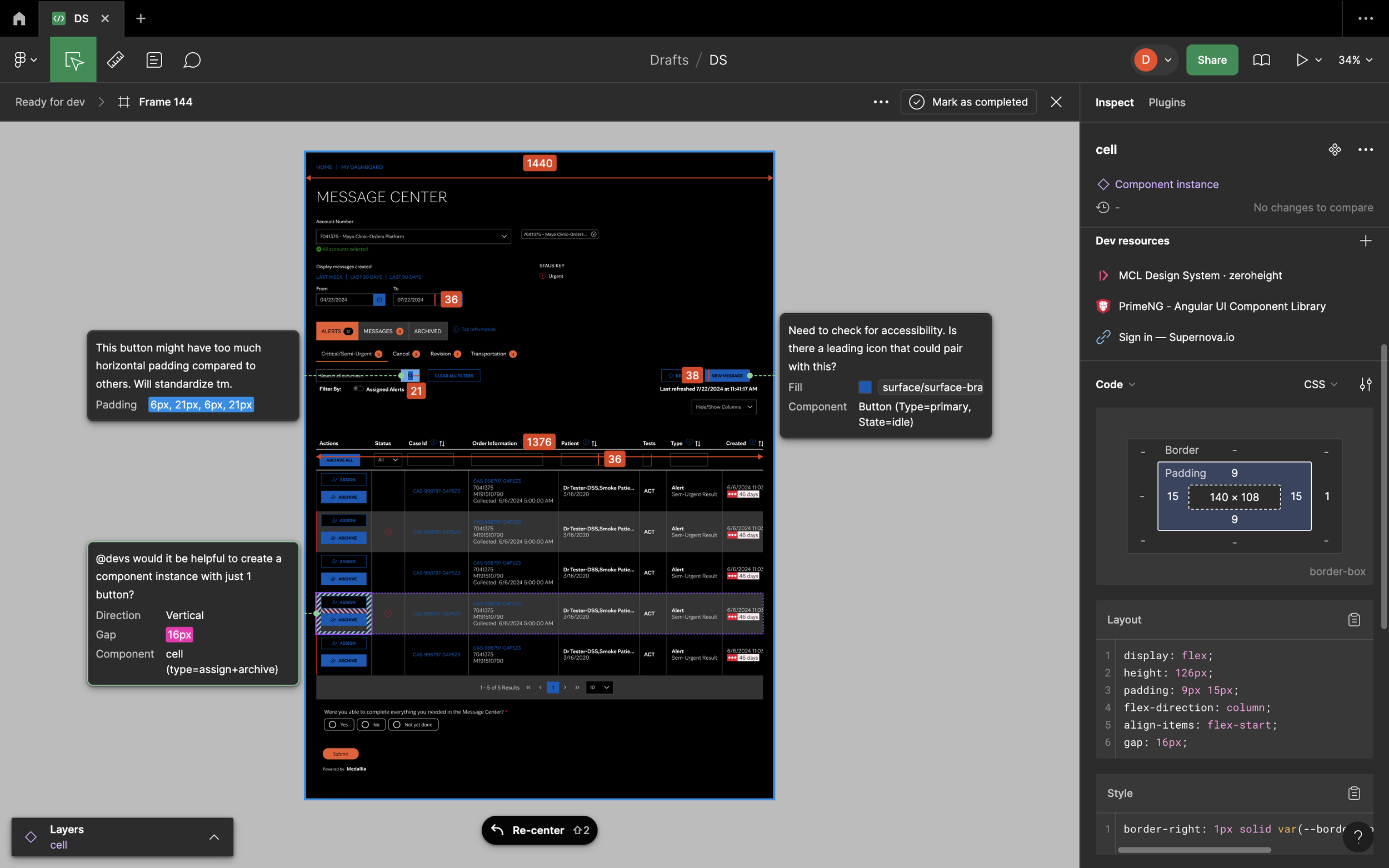
Let’s open of Dev Mode on Figma and leave some notes so for our developers so that we can ensure a smooth handoff process (as smooth as it can be, at least).
Using Dev Mode, we have marked designs as “Ready for Development”, called out measurements of important components, and linked to our reference site as well as other design system resources. These extra steps the designer can take help developers feel confident that they are building the right things.
A Design System in Code
In addition to taking substantial first steps to create a design system for MCL based in Figma, it is also important to do so in code. I am not a front-end developer (yet), but I think it’s important for designers to better understand the process that developers go through to create design systems in code. So let’s do that.
Let’s start simply, by picking one instance of a button from our Message Center page. Let’s open up the Developer Tools to get more information on its HTML and CSS properties.
Now, let’s create a React app. This will test whether the button component we build in code will actually work on the Web.
A boilerplate React app.
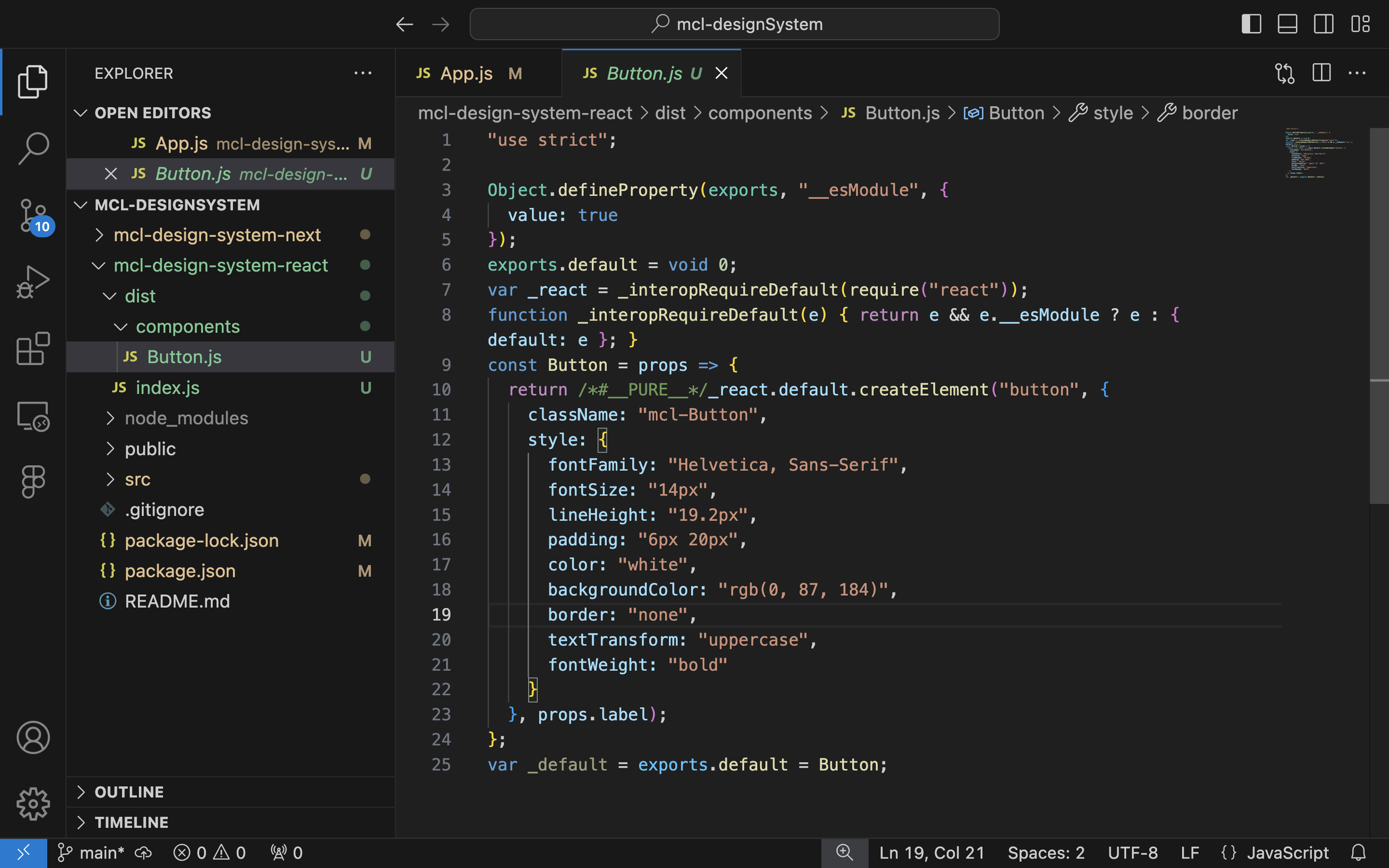
Now, let’s code a button using HTML, CSS, JS, and React.
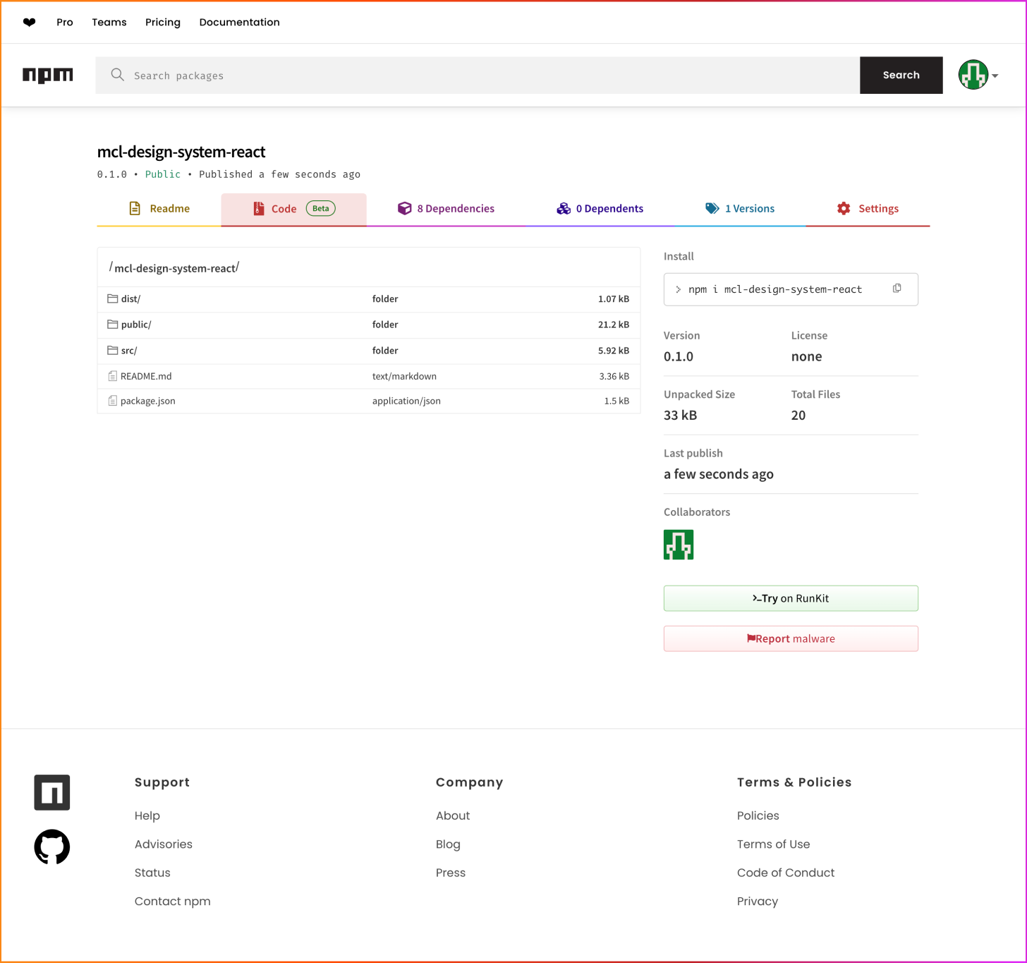
We did it! Now, let’s take the very first step in creating a design system in code by uploading our files to a Package Manager.
In this example, let’s use NPM, or Node Package Manager, a popular choice for design systems.
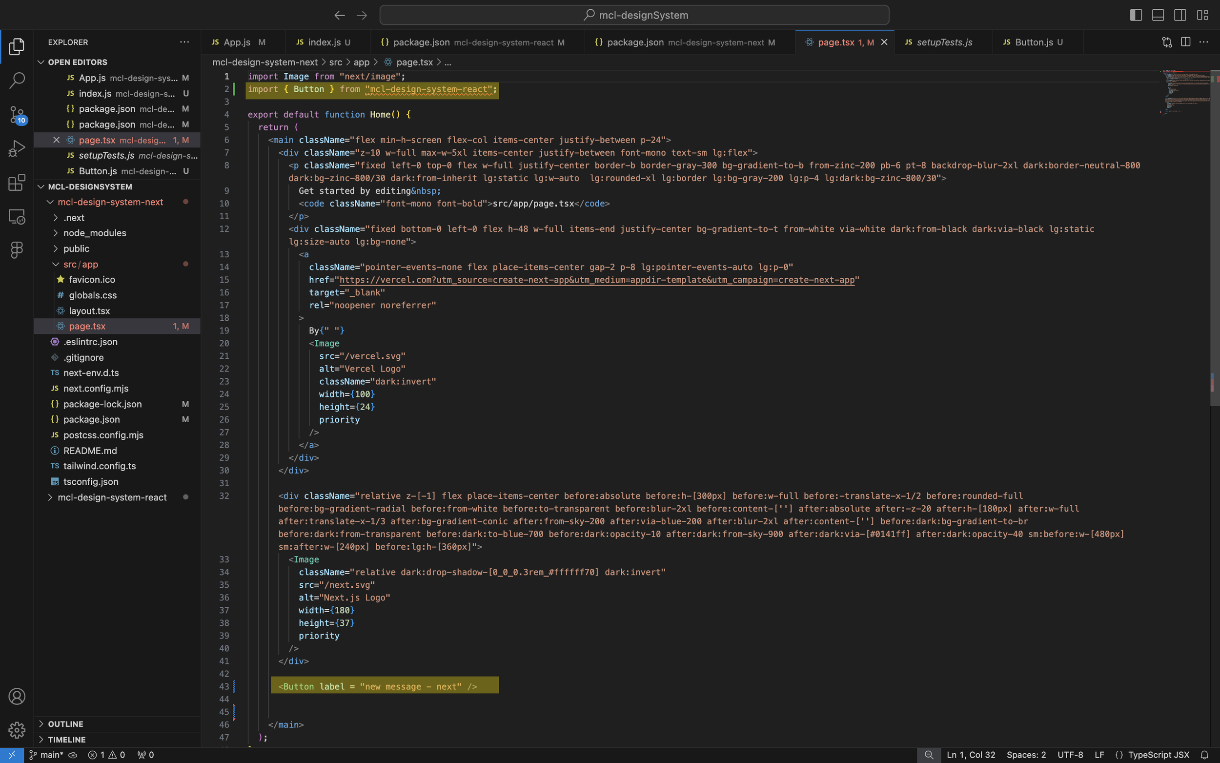
Let’s run one more test to ensure that our design system is usable by any programmer, regardless of the framework. We’ll also edit the text to make sure it’s modifiable.
The key lines of code that import the button from our design system and insert it into the page are highlighted.
This time, we’ll see if the button appears on a Next.js app.
It worked! We have successfully built a design system in Figma and in code. Thanks for following along!


